
Birtz Brand Identity and Packaging
Selected Work · Women’s health and supplements

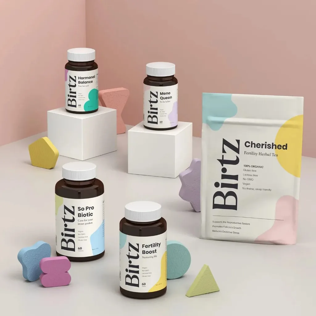
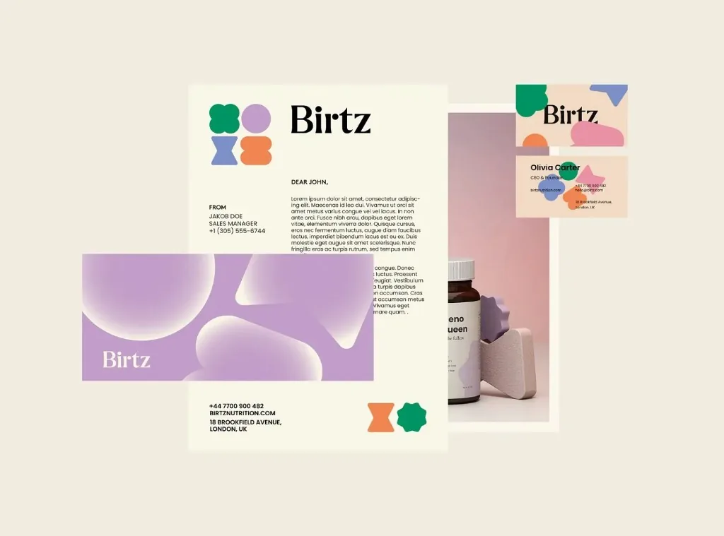
A connected visual system for a women’s health supplement brand, created to support product recognition across packaging, stationery, and digital presentation.
Birtz required a clear and consistent visual identity that could work across physical products and digital customer touchpoints. The system needed to support product information while maintaining a recognizable brand presence.
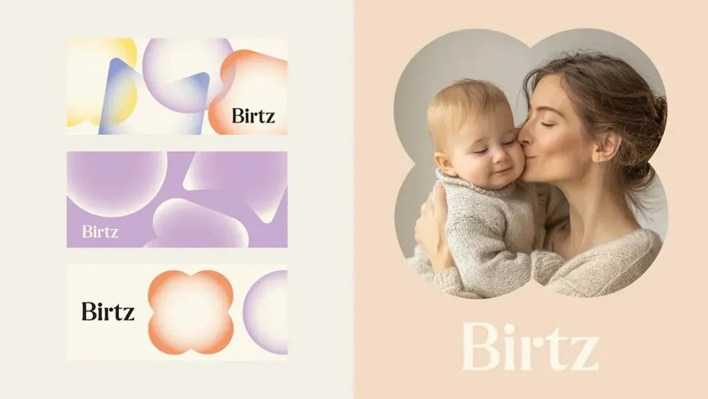
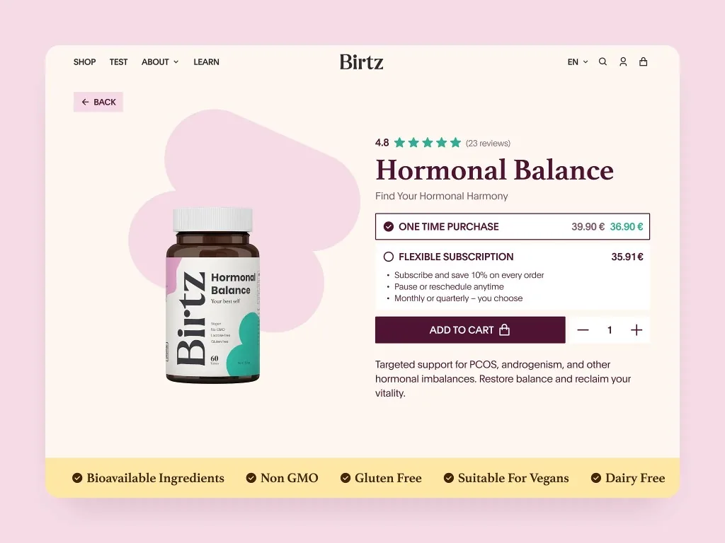
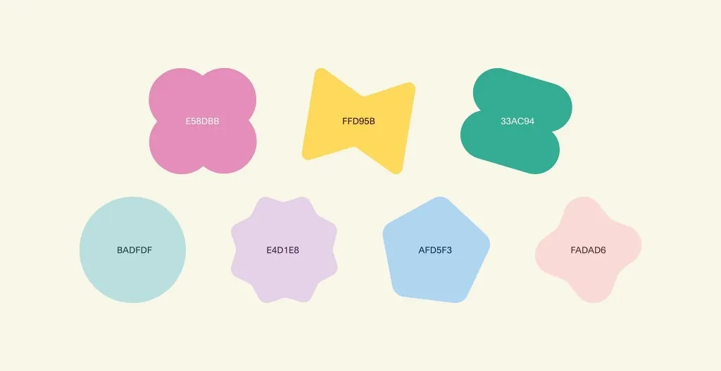
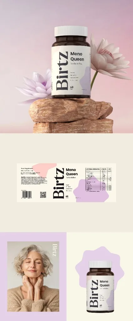
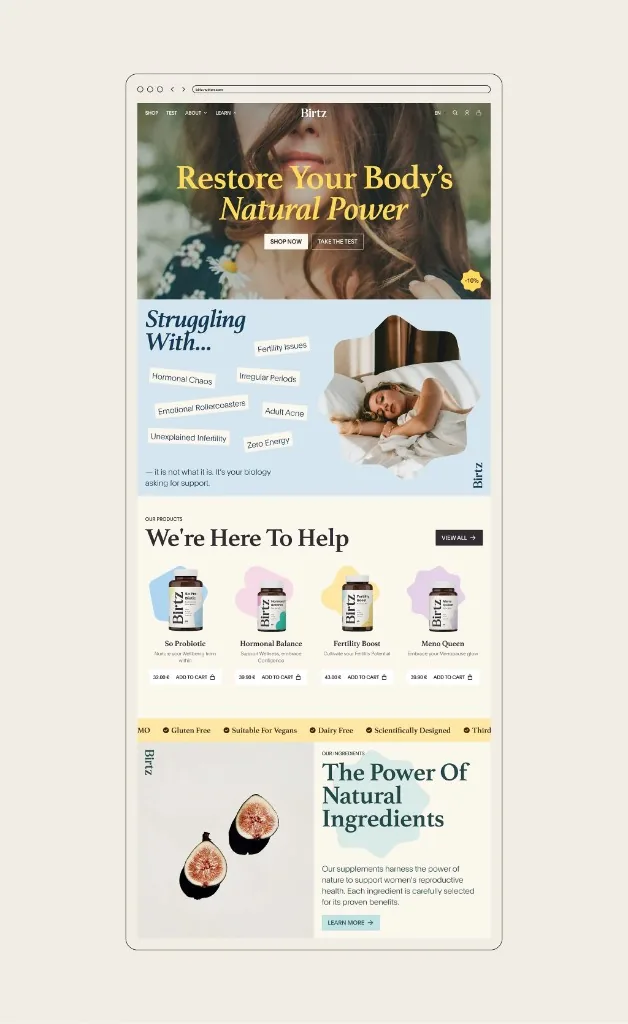
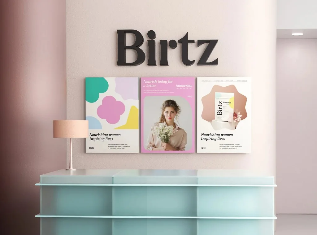
theclickUp developed the agreed identity direction and applied it across packaging, stationery, color, and digital product presentation. The work focused on consistency, readability, and practical use across the brand system. The identity direction created a visual foundation for the brand and its product range. Logo use, color, typography, and supporting elements were considered as parts of one system. The packaging work organized important brand and product information within a consistent family. Final production claims, regulatory content, dielines, and supplier specifications remain subject to client and manufacturer approval. Website and product page design extended the identity into the online buying experience, giving customers a consistent presentation from first impression to product information.
Need a Brand System That Works Across Product and Digital?
Discuss your branding, packaging, or digital product presentation needs with theclickUp.